| Met Office Hadley Centre observations datasets |
| > Home > HadAT > |
The plots below are from the the HadAT paper (Thorne et al.,2005). They were produced using seasonal data during the initial development of HadAT1 and HadAT2 and are not updated. These graphics files are crown copyright. Each plot is presented here as a png image, but a link to a postscript version more suitable for most purposes is also provided.
Please note that these are deliberately set to be exact replicas of the paper originals. Hence we have not converted the colour scheme as done elsewhere on the dataset site to ensure accessability. This may be possible on a request basis.
 |
 |
 |
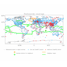
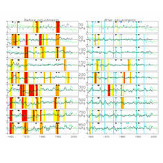
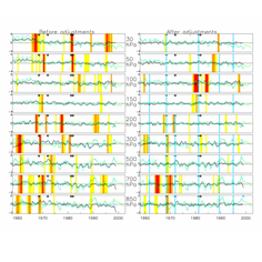
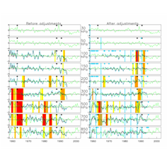
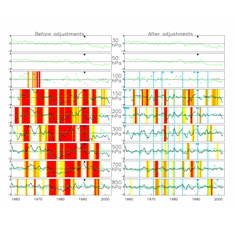
| Figure 1: Locations of radiosonde stations with 2 example neighbour regions. | Figure 2: Timeseries plots for station 8495 (Gibraltar). The station series (blue), the neighbour series (green) and the difference series (black) are shown with black crosses that denote metadata events. The vertical bars represent K-S test results below 0.01 (red), 0.05 (orange) and 0.10 (yellow). Blue crosses denote deletions and vertical blue bars indicate where adjustments were applied. | Figure 3: As figure 2 but for station 47412 (Sapporo, Japan). |
| Full size png | Full size png | Full size png |
| Full size encapsulated postscript | Full size encapsulated postscript | Full size encapsulated postscript |
 |
 |
 |
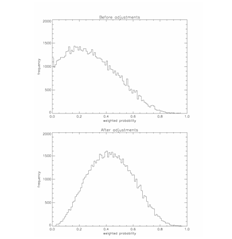
| Figure 4: As figure 2 but for station 20107 (Barencburg, Russia). | Figure 5: Summary of K-S test results before and after the QC proceedure. For each station and each time-step the results have been multiplied together and renormalized by 1/n where n is the number of pressure levels with a K-S test result. | Figure 6: As figure 2 but for station 43333 (Port Blair, India). |
| Full size png | Full size png | Full size png |
| Full size encapsulated postscript | Full size encapsulated postscript | Full size encapsulated postscript |
 |
 |
 |
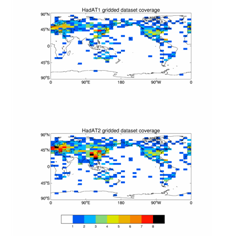
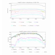
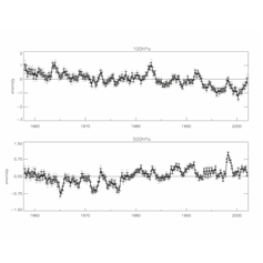
| Figure 7: Maximum station coverage for each gridbox in HadAT1 (top) and HadAT2 (bottom). | Figure 8: Station attendance in HadAT2. By WMO region and globally at 500 hPa (top - with a logarithmic attenance axis) and globally by pressure level (bottom - with a linear attendance axis). | Figure 9: Global mean HadAT2 timeseries for 100hPa and 500hPa. Bars denote the absolute (faint) and 5th to 95th percentile (bold) ranges of uncertainty estimates. |
| Full size png | Full size png | Full size png |
| Full size encapsulated postscript | Full size encapsulated postscript | Full size encapsulated postscript |
 |
 |
|
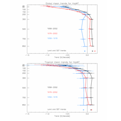
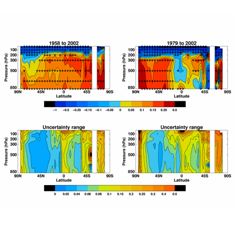
| Figure 10: Global and tropical trends (K/decade) with uncertainty estimates. Whiskers denote 5th-95th percentile (bold) and range (feint) of estimates. | Figure 11: Zonal mean trends in HadAT2 (top panels) and their associated uncertainties (bottom panels). Crosses in trend panels denote significantly non-zero values. | |
| Full size png | Full size png | |
| Full size encapsulated postscript | Full size encapsulated postscript | |
Commercial and media enquiriesYou can access the Met Office Customer Centre, any time of the day or night by phone, fax or e-mail. Trained staff will help you find the information or products that are right for you. |
 |
Maintained by: Holly Titchner |
© Crown Copyright
|